
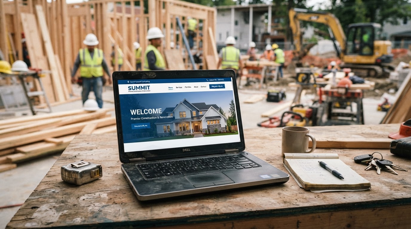
Most contractor websites were built to look good, not to make money. You paid someone a few hundred or a few thousand dollars, they handed you a nice-looking site with your logo, a few photos, and a contact page, and you checked "website" off your to-do list. Two years later, that site has never generated a single lead you can trace. It sits out there on the internet like a digital brochure, pretty enough, but completely useless at the one job a business website actually exists to do — capture leads and turn them into booked jobs.
If your website has never handed you a name and phone number you did not already have, it is not a marketing tool. It is an online business card, and it is costing you jobs every single week. Let's break down exactly why most contractor websites fail, what a lead-generating site does differently, and what to change first.
The Brochure Site Trap
A brochure site is built around the idea that a website is a place to display information. It has a home page, an about page, a services page, and a contact page, and that is about it. The home page has a big photo and a welcome message. The about page tells your company story. The services page lists what you do. The contact page has a form and a phone number. It looks professional. It answers questions. And it does almost nothing to turn a visitor into a customer.
The problem is that a brochure site is passive. It waits for the visitor to decide to contact you, and most visitors do not. They land on the home page, glance around, maybe click a service, and leave. There is nothing pushing them toward a decision, no clear next step, and no urgency. The site is a static display case, not a salesperson. A lead-generating website is built the opposite way — every page exists to move the visitor toward one specific action, and the design makes that action obvious and easy.
Your Phone Number Is Buried
The first thing to check on your current site is where your phone number lives. Go pull it up on your phone right now. How many taps does it take to find your number? Is it a tiny line at the bottom of the page? Is it only on the contact page? Is it a plain text number that the visitor has to copy down and dial by hand? Every one of those is a lost call.
On a lead-generating contractor website, the phone number is the loudest, easiest thing to find on every single page. It is a tappable button at the top of the screen, so a mobile visitor can call you with one thumb. It is repeated in the header, in the body of the page, and at the bottom, because you never know which moment the visitor decides to reach out. The rule is simple: if a motivated homeowner has to do more than one tap to call you, half of them will not bother, and they will call the next site that let them tap to call.
Here is the number nobody talks about. The majority of your website visitors are on a phone, and a huge share of them are looking at your site because they have an active problem right now — a leak, a dead AC, a roof that just started leaking in a storm. These are not casual browsers. They are people with an emergency, and the contractor whose site lets them call with one tap gets the job. Bury the number, and you bury the lead.
No Clear Call to Action
A brochure site has a contact page and assumes the visitor will find it. A lead-generating site has a clear, repeated call to action on every page, and it is not generic. "Contact us" is not a call to action. It is an instruction with no urgency and no reason. A real call to action tells the visitor exactly what to do next and why it benefits them.
Good examples: "Call now for a free estimate." "Text us a photo of your project for a quick quote." "Book your inspection online in 60 seconds." Each one tells the visitor the next step, makes it sound easy, and gives them a reason to take it right now instead of later. The call to action should appear above the fold on the home page, repeat after every section, and be the last thing they see before they leave the page. A visitor should never have to wonder what to do next on your site, because the site should be telling them at every scroll.
Your Site Is Slow on a Phone
Here is a killer most owners never think about. A huge share of your mobile visitors will leave a site if it takes more than a couple seconds to load, and most brochure sites are heavy and slow. Big background images, autoplay videos, and clunky code make the site crawl on a phone over a normal cell connection, and the visitor bounces back to the search results and clicks the next contractor.
Google knows this, and it punishes slow sites in the search rankings directly. Site speed is a confirmed ranking factor, meaning a slow site does not just lose the visitors who land on it — it never gets the visitors in the first place, because Google buries it below faster competitors. A lead-generating site is built lean and fast, with compressed images and clean code, so it loads quick on a phone in the middle of a job site with a weak signal. Speed is not a vanity metric. It is the difference between being found and being invisible.
No Way to Capture the Visitor Who Is Not Ready to Call
Not every visitor is ready to call the second they land on your site. Some are researching, comparing options, or planning a job for next month. A brochure site has no way to capture those people. They leave, and you never know they were there. A lead-generating site has a lightweight way to grab their contact info before they go, so you can follow up later.
This can be a simple lead form that offers something useful in exchange for their email or phone — a free estimate, a maintenance checklist, a seasonal tip sheet. The point is not to close the job on the spot. The point is to turn an anonymous visitor into a name and number you can reach out to. Most contractors only chase the ready-to-call crowd and ignore the larger group who is interested but not yet ready. The site that captures both is the one with a full pipeline a month from now.
The Mobile Experience Is an Afterthought
Most contractor websites were designed on a big desktop monitor and then squeezed onto a phone as an afterthought. The result is tiny text, buttons too small to tap, menus that do not work on a touch screen, and a layout that makes the visitor pinch and zoom just to read a phone number. On a phone, that experience is painful, and painful experiences get abandoned.
A lead-generating site is built mobile-first, meaning the phone experience is the primary design, not the compromise. Text is readable without zooming. Buttons are big enough to tap with a thumb. The phone number is a tappable button, not an image. The form works with one hand. Every decision is made for the person holding a phone with one hand while standing over a broken furnace, because that is the person actually landing on your site.
Where to Start Fixing It
You do not have to rebuild everything at once. Start with the highest-impact fixes. Make your phone number a giant tappable button at the top of every page. Put a clear call to action above the fold on the home page. Add a simple lead form that offers a free estimate. Compress your images so the site loads fast. Then, if the site is still not producing leads, consider whether the whole thing was built to display information or to capture customers — because those are two very different websites, and only one of them pays for itself.
If you suspect your site is a brochure pretending to be a marketing tool, grab a free audit. We will load it on a phone, show you exactly where visitors are bouncing, and tell you the single change that would turn it from a cost into a lead source.
Turn Your Website Into Your Best Salesman
We rebuild your site into a lead-generating machine — fast on a phone, one-tap to call, built to capture the visitor who isn't ready to pick up the phone yet. Let's stop paying for a brochure and start generating leads.